If you have been following our previous posts, Airflow @ Agari and Leveraging AWS to Build a Scalable Data Pipeline or our recent talks on data pipelines and Apache Airflow, you are well aware that Agari leverages both the public AWS cloud and open source technologies, such as Apache Spark and Apache Airflow, to build resilient predictive data pipelines. This summer, we had the pleasure of welcoming some interns to help us further improve our cloud-based data infrastructure. The following chronicles some of the contributions that Norman Mu, an incoming junior at U.C. Berkeley, made to the Apache Airflow project.
Problem 1 : Misleading Task Duration Charts
Agari currently leverages Apache Airflow to orchestrate batch workflows in the area of model building and hourly aggregation. We run completely in the AWS cloud and leverage both stand-alone Spark clusters and EMR Spark. Sometimes, we find that our Spark jobs fail in transient ways. One of the benefits of using a workflow scheduler is the ability to retry tasks in a workflow (a.k.a. Directed Acyclic Graph or DAG) to work through such transient failures. Airflow lets us do this. However, one drawback with Airflow is that the charting that ships with current (1.7.1.3) or previous releases is misleading. Consider the DAG below:
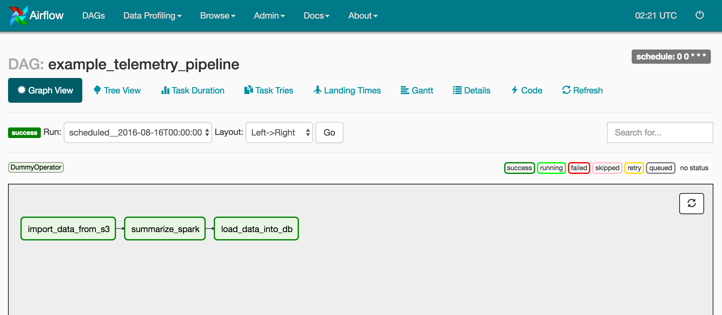
In the representative DAG example above, there are 3 tasks or stages that closely mimic our use case:
- import_data_from_s3 - read new customer data from an S3 bucket
- summarize_spark - score and summarize customer data
- Scoring is the process of applying trust scores to email that our customers have received
- This enables Agari to protect our customers from email-borne threats
- We further summarize this scored data in interesting ways
- We leverage Apache Spark for both scoring and summarization
- load_data_into_db - load this scored data into a DB
- We store the scored and summarized data in a form that is digestible by enterprise customers using our web application
These stages closely resemble the standard ETL (extract-transfer-load) process that you may be familiar with in the world of business intelligence or analytics, except we apply homegrown trust models to our input data.
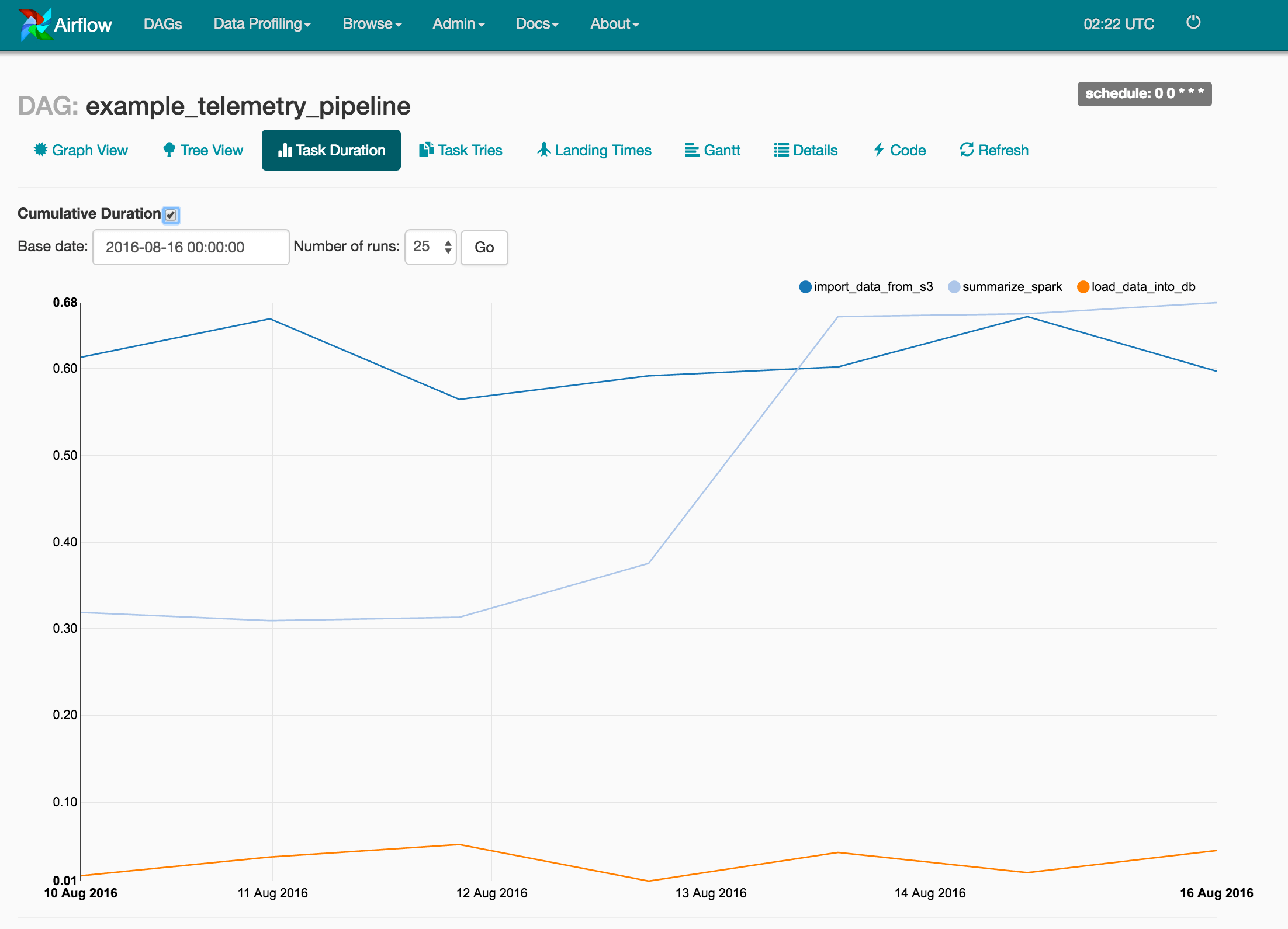
As mentioned earlier, the current Task Duration chart is misleading. For example, in the chart below, it appears as if each of our 3 tasks is performing in a nearly consistent manner from run to run. However, what happens if there are transient failures and retries? Unfortunately, the chart below only displays the Task Duration for successful attempts and not the cumulative time taken for that task to eventually succeed!

Introducing 2 New Charting Features : Task Tries & Cumulative Task Duration
Norman added a new checkbox to the Task Duration Chart to reveal total time taken by a task, a.k.a. Cumulative Task Durations.
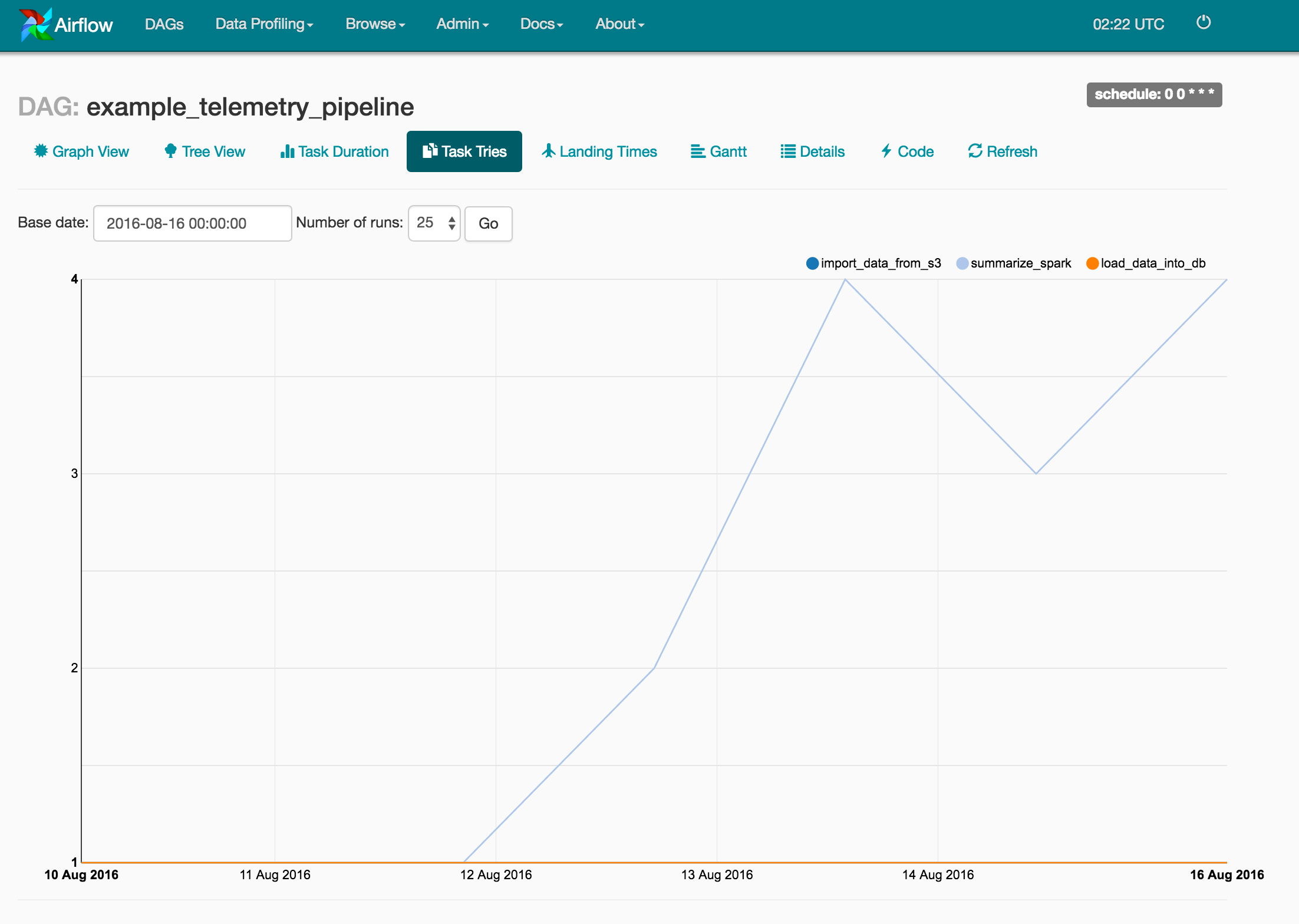
He also added a new Task Tries chart to display how the number of task tries trends over time. As shown below, issues with the summarize_spark task started appearing on August 12, and are resulting in more than 1 task try before the task succeeds. Unfortunately, these multiple attempts often lead to delayed DAG completion and missed SLAs (i.e. a daily DAG does not complete within a day).
Problem 2 : Limited Stats on the Overview Page
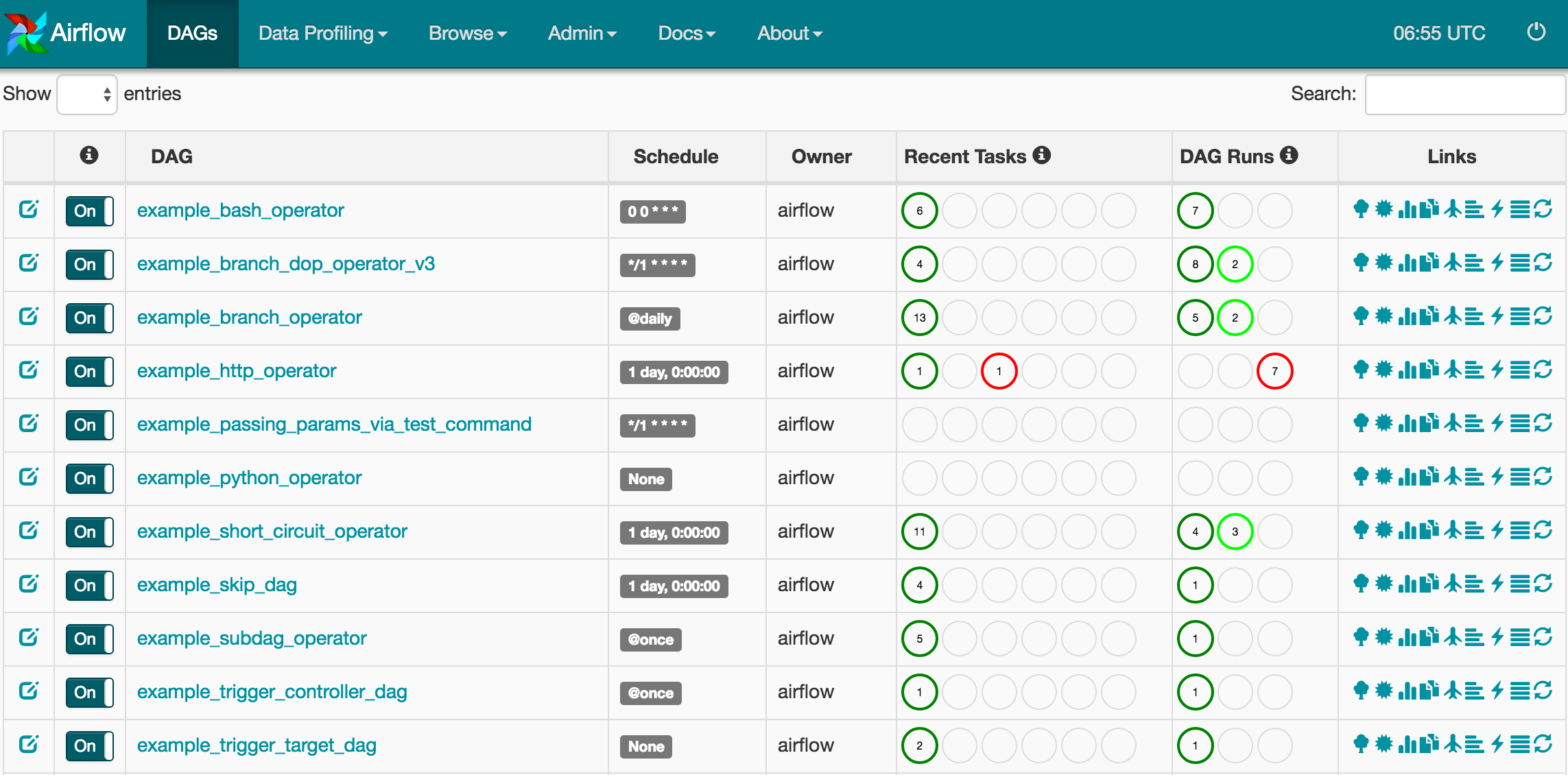
We recently improved the DAG Overview page. If you have used Airflow in the past, you will be aware of a Recent Tasks column - this shows the states (e.g. queued, running, skipped, success, failed, upstream failed) of tasks in the current DAG run. In the image below, for the first DAG (i.e. example_bash_operator), we can see that 6 tasks have completed successfully (i.e. dark green circles) for the most recent DAG run. Norman recently added a Dag Runs column, which shows the status of all DAG runs since the beginning of time. Again looking at the example_bash_operator DAG in the example below, you will notice that 7 DAG runs have succeeded (i.e. dark green circle). The 3 circles reflect the 3 states of a DAG run : success, running, and failed, from left to right.
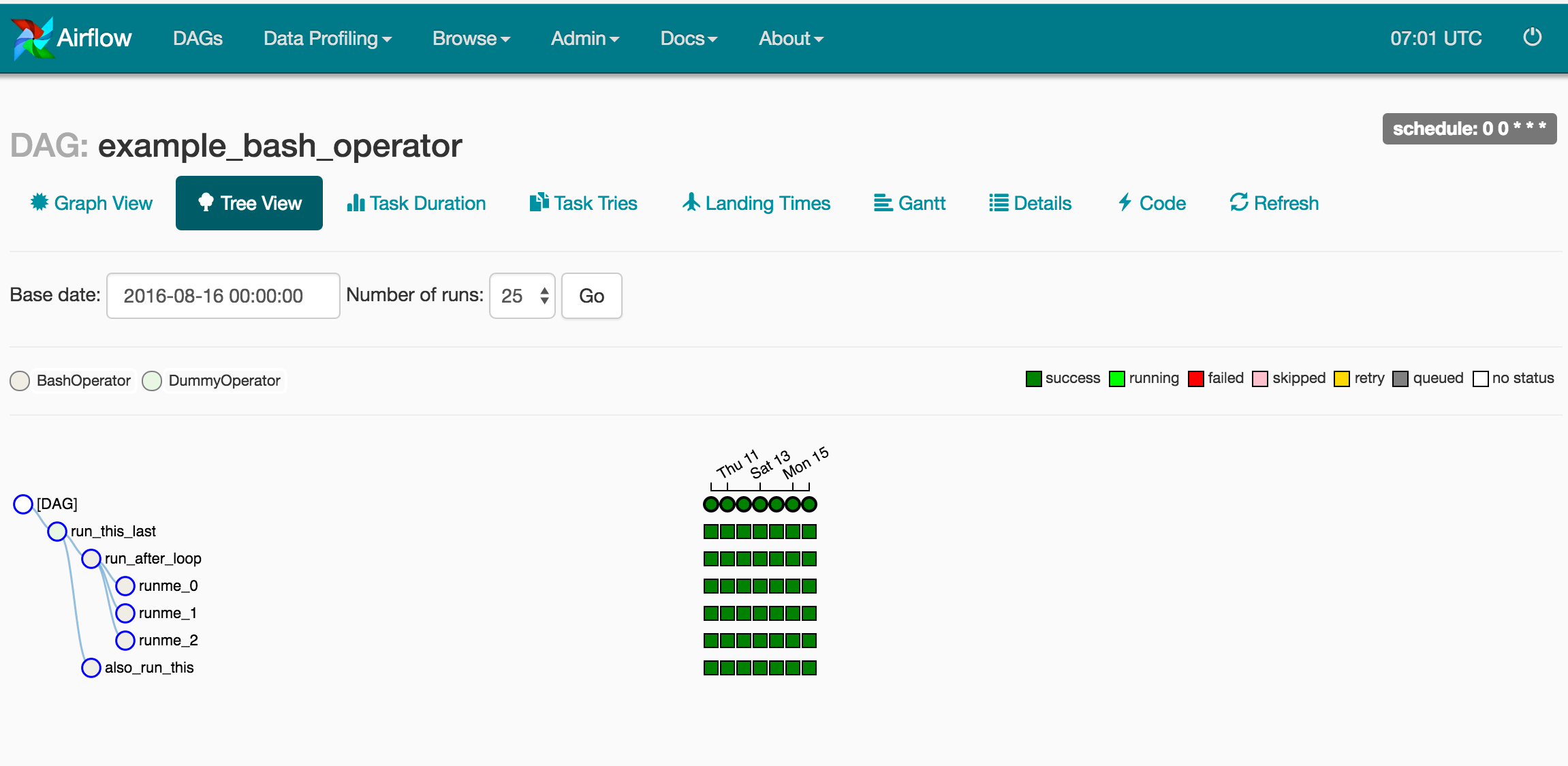
If you click on the example_bash_operator DAG name link, you will be taken to the Tree view below, where you can see the 7 DAG runs that succeeded. You will also notice the 6 Tasks (vertical column of dark green squares) for the most recent DAG run that succeeded, which correspond to the dark green circles in the Recent Tasks column on the Overview page above.
Problem 3 : Missing Integration Points with Automation
As mentioned in a previous blog post, we leverage Ansible and Terraform to automate our entire infrastructure. Airflow exposes the management of some configuration (e.g. Variables, Connections, Pools) only via the Admin Web page, which renders automated deployment of an Airflow installation incomplete - we need to manually insert these values. There are a few commits in-flight and others already merged to address this expanding the set of CLI commands available:
Bio
Norman Mu is an incoming Junior at U.C. Berkeley studying Computer Science and Applied Math.
